If you’re struggling to create an inspiring presentation at short notice, try using these ten great tips…
1. The Colour Scheme
Using a strong and varied palette of colours can do wonders for your presentation’s aesthetics. Simple, unobtrusive backgrounds, mingled with text of a well-contrasted shade, will give your slides the professional look that audiences crave – and by using primary and secondary colours for your text, you can subtly draw your viewers’ attention to the most important areas of your slides.
Not only that, but by selecting your colours carefully, you can cunningly manipulate your audience’s mood to your own ends, without them even knowing it. Want to fill them with a furious resolve? A nice reddish background should do the trick. Need sympathy? Turquoise text on a creamy beige backdrop will suit you very nicely.
2. Feature Positioning
Be ever mindful of the natural slide-viewing impulses of your audience. When a new slide is displayed, most people tend to scan the title and main pictures first, followed immediately by the text and smaller pictures, which are generally viewed from left to right and top to bottom. It is believed, also, that viewers’ subconscious concentration levels tend to be at their highest while reading the beginning and ending of any given text – a concept which is illustrated below.

So, tailor your slides around these trends by making your main picture as relevant as possible to the text on screen, and making your most important points in the first and last bullet points.
3. The Font
More significant than you’d think, this one. You may not know it, but the fonts used by modern word processors fall into one of two distinctive categories: serif and sans serif. The crucial difference is that serif fonts have minuscule “tails” at the end of some letters, while sans serif fonts do not.

While this in itself seems a minor difference, it is in fact crucial to use sans serif texts whenever presenting on screen. This is because, depending on the type of monitor you use, the tails on the ends of serif fonts are apt to flicker when displayed. Even worse, low- to mid-resolution screens can cause the serifs themselves to be magnified or disappear altogether when projected. With this in mind, you’d be well advised to stick with a clear, bug-free sans serif that can be read from anywhere in the room. Arial, Verdana or Tahoma are all safe bets.
Once you’ve chosen your font style, use it consistently throughout the presentation; do not switch from Arial to Mangal to Impact and back again. While we’re on the subject, you should never use text smaller than font size 18, or larger than 44. Anything outside of this bracket will cause either incurable strabismus or exploding eyeballs.
Finally, avoid using underlined or all capital letters; these serve only to patronise your audience. Instead, highlight your key sentences using alternative colours, italics or bold lettering – they’re far more subtle and won’t rob your viewers’ attention from the lesser (but still important) sections of your slide.
4. The Word Count
Examine, if you will, the two slides below. Which do you prefer?

The second? Good. Nine out of ten audiences will agree with you.
5. Pictures
Being a universal language, the picture can prove invaluable in putting your message across – particularly if yours is an audience of non-English speakers.
A Tuscan dawn, the ocean floor, or even, dare I say it, a smiling cat, are all emotive and immediately recognisable images that can be used to articulate ideas far more quickly than words. Just make sure they’re relevant to your topic, and you’ll have heads nodding in appreciative comprehension within seconds.
A word of warning, though: unless you wish to categorise yourself as a beacon of cornball unoriginality, clichéd clip art and worn-out stock photos should be avoided at all costs.
6. Multimedia
The use of video and/or audio segments during your presentation can serve numerous useful purposes. First and foremost, these pieces can be used to give solid backing to the point you’re trying to convey. To revert to our cat-food theme, for instance, an interview clip from an impressed survey participant, played at an appropriate time, will help support your claim to nutritional superiority. Not only that, but the video will also act as a handy pace-changer to keep your viewers engrossed and engaged.
It is advisable to play your clips directly from PowerPoint, though, since this will help your presentation to flow seamlessly. And avoid using more than ten minutes’ worth of multimedia for each hour of speaking; clog your presentation with back-to-back clips and you risk coming across as complacent.
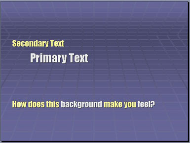
7. The Backgrounds
Always remember that your projection slides should never constitute your audience’s main point of attention – they should act merely as backing tools to support your discussion.
With this in mind, you’ll want to minimise unwanted distractions by keeping your backgrounds as basic as possible throughout your talk. That said, you should consider altering the backdrop at the end of each subject. This will subconsciously alter your viewers’ mood, so if you’re discussing future business, a nice light blue (representing the clear skies ahead) might conjure up enthusiasm. Or, if you’re analysing your past performance, a pleasant yellow tint might convey your statistics in a more optimistic light.
Be aware, though, that projected images often look paler than they do on your computer monitor, so avoid subtle cream colours; they’ll appear white as paper on the big day.
8. Charts and Diagrams
Charts can prove a naturally convenient and effective means of displaying information. But there are one or two pitfalls that presenters routinely fail to circumvent. Consider your audience – their knowledge level, corporate familiarity and general demographics.
If we’re honest, it may be that your viewers are hardly the sharpest tools in the box. So, avoid abbreviations and commercial jargon, withhold unnecessary details, and use a fool-proof legend for each of your diagrams. All of this will give a “user-friendly”, down-to-earth tone to your data.
You’ll also find that by using different types of diagrams to portray different types of information, you can mould the statistics in your favour. If you want to de-emphasise a disappointing set of sales figures, for example, a table will show the facts far less wantonly than a pie or bar chart would.


9. Promote your Business Culture
To instil a strong sense of company identity and build a corporate rapport with your listeners, find creative and subtle ways to implement an element of your organisation’s character into some of your slides.
Whatever your business model, a series of well-thought-out diagrams should spread your corporate zest among the audience and bring them round to your way of thinking. To go back to our cat-food example once more, why not use an illustration of a sealed food can (representing the potential profits) accompanied by a tin opener whose different sections – the handle, the shaft, the blade and so on – symbolise your separate internal departments? Or how about a labelled illustration of a cat peering longingly across the garden to its cat-flap (a symbol of the doorway to success)? Several obstacles could stand in the feline’s way – a water sprinkler, a thorny rose bush, a raging pitbull – each representing an economic challenge your company faces on the road to your target goal.
Whatever you do, though, don’t incorporate your company logo or slogan into every slide – this will undermine your creativity and passion for the business. The first and last pages will do just fine.
10. Go Pro
If you’ve been asked to give a presentation at very short notice and lack the technical know-how to pull it off in time, it’s advisable to commission a dedicated consultant to do the groundwork for you. Remember, visual aesthetics are a major element of any successful presentation, so it’s crucially important that yours looks the part – your reputation might just depend on it.
George Dixon