Charts can be very boring, but it doesn’t have to be that way. There are lots of different ways to make them more interesting.
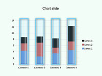
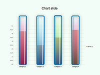
There are some examples in these files of how you can make bar charts more interesting, by overlaying graphics on top of the actual chart.
Of course you shouldn’t overdo it, but in the right context it can really work wonders.
Your own chart is unlikely to match the example files, but you can adjust them to a degree, to suit different charts.
The examples just make use of transparencies and fills to create the various effects.
Here’s a step-by-step guide on how you can create overlay graphics yourself, these principles can be used in many design programs, such as Illustrator, Freehand and PowerPoint, but the example provided is for PowerPoint.
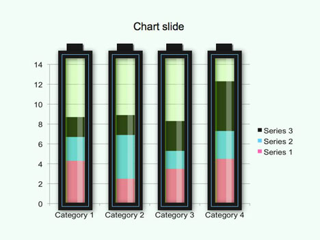
For our example we will create a transparent tube to go over each bar of the bar chart.
- First, on a blank slide create a bar chart, for our example we want four bars with 1 series of data in each.
- Then create a rectangle with no fill that is slightly wider then the width of your bars on your chart. Make sure this layer is in front of the chart layer.
- Then create another rectangle just a shade smaller, this time give it a fill but no line. Then in the fill options reduce the transparency to around 20%. Send this layer backward so it is under the first rectangle.
- For the shading make another rectangle the same height as the last layer, but much thinner. Give this a fill but no line. The fill needs to be white or a slight off-white, and to have a transparency of around 20%. Send this back one layer so it is behind your first layer but in front of layer 2.
This should now have created a basic graphic that has a glass-like transparent effect. You can now group your graphics and duplicate them and place them over the other bars in the chart.
That’s all there is to it. Experiment with different fills, colours and strokes to create interesting graphics for your charts.
If you liked this PowerPoint Template we would appreciate you liking it on FaceBook or Tweeting it.
Published On: 5th Jun 2022
Read more about -Business Powerpoint Templates , Chart, Director's Cut Template number 00419
-
so cool :-0!! I’d like to make my ppt files like this.
-
Just like what you said…
You turn Boring thing into amazing thing!!!
Thank you..
-
I just want to say “thank you for your sharing”.
It’s really useful to me. -
This is a cool idea.
Could you tell me how to create charts with different y-axes on the left and right verticals? For example, if the x-axis has years and the left y-axis should show each year’s sales (in $) in a bar chart and the right y-axis should show the year-on-year growth rates (in %) in a line chart.
Cheers. -
excellent! thanks for making this for all of us
-
Thank you for your sharing and very useful to me.
-
great tip! thanks 🙂
-
thaks alot. it’s so easy to use this web!!!!!
-
brilliant
-
nice ideas but i could’nt find my chart -)
thanks 3> -
What was your chart?
-
Just a word “Awesome”….