
At Presentation Magazine we are great believers in the power of visual information. A lot of presentation research shows that really “a picture is worth a thousand words” – with message retention being increased over words by a factor of five. It was a real treat to come across a presentation by Karl Fast on Visualization of Information.
Karl Fast is a doctoral student from the University of Western Ontario, in London, Ontario, Canada and has kindly allowed us to reproduce extracts of his presentation “Information Visualization: Failed Experiment or Future Revolution?
“Now I’m going to illustrate some of the basic principles of information visualization by taking a simple example and building it up. I am not going to explain techniques like the perspective wall, or the differences between geometric and semantic zooming. Rather, this is just a simple example to illustrate the basic ideas.”
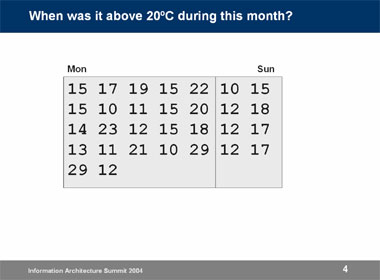
With a little time we could work out the days, but if we are to add in some simple visual colour coding.
temperature chart with numbers highlighted 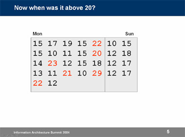
This illustrates the power of visual perception. Graphic designers use this all the time when creating posters. They know how to make some things stand out. But information visualization aims to exploit this in a different way: through interaction.
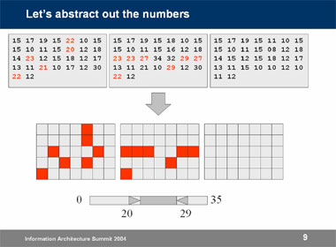
But we can abstract away the numerical data, transforming it into a visual representation. Note that these boxes could represent almost anything, not just temperature. We are moving away from a system designed specifically to deal with temperature, to a framework that can handle a wide range of data.
This is one of the best examples of visual communications to portray information that I have seen in a while and it demonstrates that some simple concepts can be highly effective.
If you would like to view a full version of the presentation you can view it on Karl’s web site.
Published On: 11th Aug 2006
Read more about -PowerPoint,Presentation Articles , Hints and Tips, Presentation Secrets
Recommended Pages


-
Your Lesson of 3 & visual communication article was very helpful.
Many thanks
-
I was admitted and giving a course on visual communication, but i do not understand the course and decided to make a research about it, so i seek for understanding on this particular course and its benefit.
-
is it confirmed?
-
define:transparencies,computer slides,television and films and the chalkboard as methods of visualcommunication.Give advantages of each and where they can be used appropriately
-
Nw i want to work on it, i think it will be very helpfull my presentation…
-
good work.
-
yeah, really helpful if we can use visual information better.
- Abstract
- Animal
- Animated
- Architecture
- Birthday
- Business
- Calendar
- Celebration
- Christmas
- Clip Art
- Maps
- Educational
- Engineering
- Flags
- Food and Drink
- Landmarks
- Medical
- Nature
- Pattern
- Science
- Shape
- Sport
- Transport
- Travel
- Valentines
- Weather
- Wedding
- Subtle Waves Template
- Business world map
- Filmstrip with Countdown
- Business 1
- Blue Bubbles
- Corporate 2
- Vector flowers template
- Filmstrip
- Editable PowerPoint newspapers
- Hands Template
- Red blood cells slide
- Circles Template on white
- Maps of America
- Light Streaks Business Template
- Zen stones template
- Heartbeat Template
- Web icons template
- Chalkboard