You’ve done some research to determine your target market and come to the conclusion that a flyer will be a great advertising tool.
Luckily, it’s easy to create a flyer, but there’s more to creating an effective advert than placing pictures and text on a page. Here are a few guidelines that you should adhere to if you want your flyer to communicate successfully with your target market.
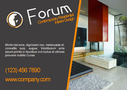
Headline
There’s a reason why the headline comes first. It is said that roughly half the time you spend on advertising should go on your headline. That may sound excessive at first, but when you consider that the heading is read by five times more people than the body copy, it sounds much more reasonable. After all, you only get one chance to make a first impression.
Humour tends to appear often in advertising – many humorous adverts are considered ‘effective’ because people remember them. This doesn’t necessarily mean that people buy the product, though. If unrelated to your brand or product, humour can detract from your message. In other words, the audience may enjoy the advert or flyer but at the same time question its purpose. Essentially, what you want your headline to do is broadcast clearly, persuasively and plainly what the audience has to gain.
Layout
Considering your layout with a blank page in front of you can be a daunting task. Don’t be put off by the white space, though; it’s vital not to over-cram the page and to keep the layout simple to convey your message.
As with your headline, you need to be direct and persuasive in a tone matched to your target audience – you want to catch attention, inform and entertain. With this in mind, think about pictures, colour schemes and copy. What pictures will resonate with the viewer? In some cases, you can sell your product by not showing it – people may be intrigued and stimulated by the unknown – but your brand must be known for this to work.
If you are going to use background colours or background images they should either end within wide margins or go right up to the page edge. If you are getting flyers printed professionally, the background design should extend beyond the page area (by at least 3mm) into an overspilling bleed area, which will be trimmed away by professional printers for guaranteed neat results.
With regards to copy, pay attention to typography. Use an easy-on-the-eye typeface for body copy and look into kerning, tracking and leading (spacing between lines and letters). It may seem trivial, but the slightest differences can make it infinitely easier for your audience to read about your product.
Call to action
The main point of a flyer is to get potential customers to do something. This is done via a ‘call to action’ or, to put it another way, the next step you want the reader to take. It might be visiting your website, calling a phone number, or buying your product.
It’s important to include a call to action on any advert or flyer as it provides direction for the customer. Whatever the call to action is, it must be very clear and very easy for the customer to do.
And finally…

Dale Cook
Once you’re happy with your design, take a good step back, maybe leave it altogether for a couple of days and come back with fresh eyes. This is where you’ll discover what you really think of your advert or flyer.
Proofing the document is also paramount. This should be done at least three times – don’t rely on spell checks to correct your grammar, and similarly don’t just look at typos and grammar discrepancies – read copy aloud to see how it rolls off the tongue. You don’t have to favour spell checks over using language that you feel will connect with your audience.
By Dale Cook, Product Marketing Manager at Serif (www.serif.com)
Recommended Pages


- Abstract
- Animal
- Animated
- Architecture
- Birthday
- Business
- Calendar
- Celebration
- Christmas
- Clip Art
- Maps
- Educational
- Engineering
- Flags
- Food and Drink
- Landmarks
- Medical
- Nature
- Pattern
- Science
- Shape
- Sport
- Transport
- Travel
- Valentines
- Weather
- Wedding
- Subtle Waves Template
- Business world map
- Filmstrip with Countdown
- Business 1
- Blue Bubbles
- Corporate 2
- Vector flowers template
- Filmstrip
- Editable PowerPoint newspapers
- Hands Template
- Red blood cells slide
- Circles Template on white
- Maps of America
- Light Streaks Business Template
- Zen stones template
- Heartbeat Template
- Web icons template
- Chalkboard